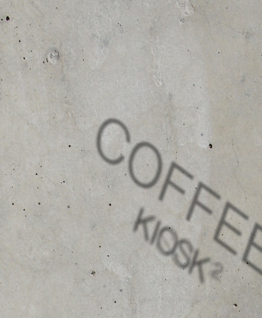
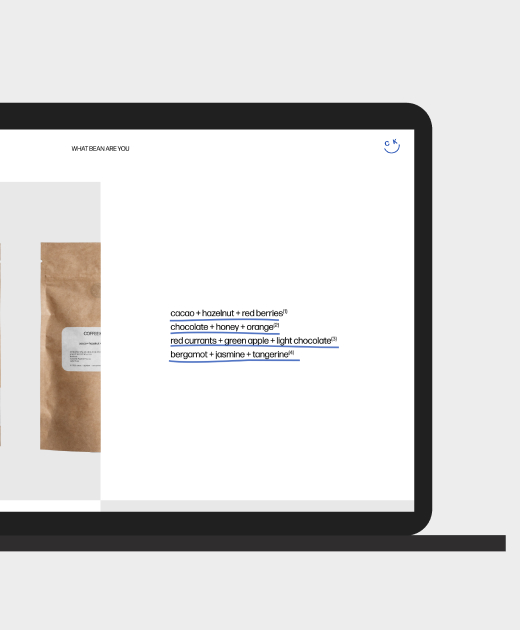
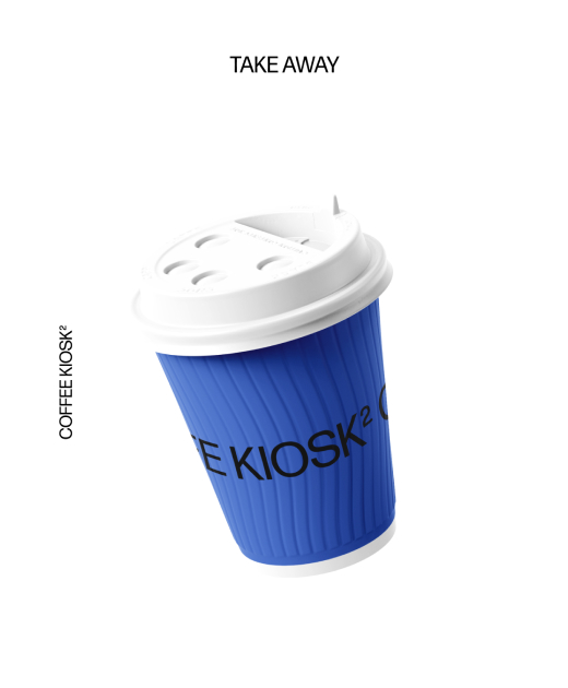
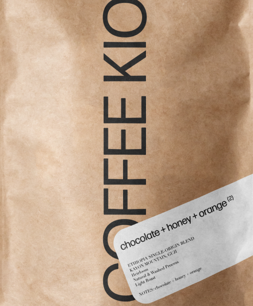
Coffee kiosk 2

Visual identity  + logo packaging design + marketing products + web flow  + webbdesign

COFFEE KIOSK ²

Coffee Kiosk is a testament to creating a lasting and instantly recognizable visual identity. Picked meticulously curated design elements with hints of deep blue, seamlessly intertwining with the aromatic essence of freshly ground coffee beans. This visual identity extends to our packaging, thoughtfully placed on shelves alongside essential brewing tools. Their handpicked coffee beans, known for their rich and elegant notes, are at the heart of these designs. It embody the quality and sophistication that Coffee Kiosk represents.
Roomers has it that the Royal family have the top floor apartment in this fashionable building. The location are off the main walk path, perfect get away in the middle of the pulse, here you find Coffee Kiosk to reset your batteries with a good cup and freshly made pastry. The color blue #4E72C1 connects with the history of royalty and the need for recognition. The architecture with in the space are narrow and perfectly small that’s where the name Kiosk suited for this space.
The products are allowing visitor’s to grab-and-go their favorite coffee, enjoy a daily baked breakfast, and even savor the convenience of long-distance bean delivery, with the freedom to choose their preferred beans. Created an identity that not only appeals to the senses but also embodies the essence of Coffee Kiosk—where quality meets convenience, and every cup is a delightful journey into the world of exceptional coffee.
Visual Identity + Marketing + Webbdesign + Naming + Print 

Kajsa Hollsten © 2024